How to hang & align framed pictures on a wall
July 30, 2006
How to hang and align pictures is a set of guidelines based on aesthetics to give a foundational understanding of the best rules to adhere to when hanging and aligning pictures on a wall.
The rules are there to be broken, so where you disagree, you may obviously do your own thing, but these are a nice set of failsafe rules that will allow those who are not quite sure on how to achieve the best arrangements to work visually in any wall space.

Having thought through the rules governing the aesthetics of hanging pictures, I have come to the conclusion that most of it boils down to people worrying about things falling on them.

Pictures of equal size generally work best when aligned horizontally side-by-side. Whether they are landscape format [ABOVE] or portrait [LEFT], they work best when side-by-side.
I think this probably stems from the feeling of a painting as almost being a window. When looking out a series of windows, it feels far more natural to move sideways and see a continuation of an outside scene than to look up or down above or below to another window.


The exception to this is where the space available dictates that another solution is more logical.
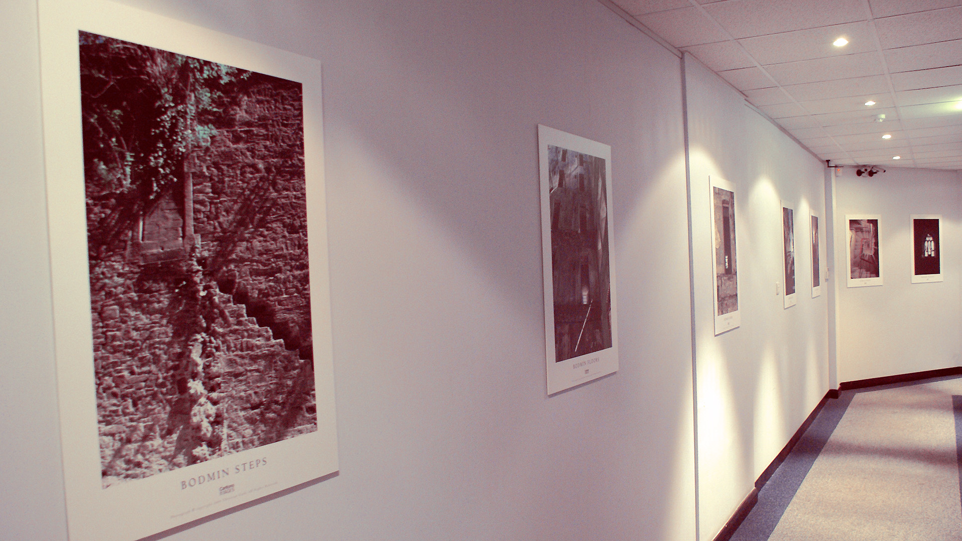
For instance, if we have three small square pictures and a door-sized piece of wall free at the end of a corridor, then a vertical stack is far more elegant as it mirrors the space it occupies.

So far this had been an easy task, as we have been dealing with identical sized/shaped pictures.
It is always best to select similarsized/shaped pictures to hang together anyway, but this is not always possible.
In traditional picture framing, a larger gap is always used at the foot of the image than at the top. The reason for this is that the space adds weight to the look of the piece and so a top heavy frame gives the uneasy look that the picture is about to fall on you.


So, hanging same-sized, same-shaped pictures is easy, but what about when we start to mix it up a bit?
Three simple rules apply:
1) Larger/landscape pictures always go above smaller/portrait images.
2) Align Horizontally from the top.
3) then Vertically from the middle unless there is single column, in which case align from a side logically suggested by the space being occupied.
Here we have four awkward pictures to align. Do not align by the outside edges as the internal spacing becomes sloppy looking.
Many people are initially tempted to select the second one down here as looking nicer.
However, the human eye prefers level horizontal lines over vertical as we’re happier seeing a level horizon. Although the second one down looks neat, the internal cross balance is not as visually calming as the two top-aligned rows from the third example below.
Stand farther away and look at the overall balance.


Here’s an example of the background dictating usage of space.
The doorway is as strong a visual element as the pictures and so must be considered when aligning frames.
You could try and argue the casefor the middle example by stating that the left-aligned arrangement is contrasting and opposing the line of the door and makes a statement.
The trouble with ‘making statements’ is that they can visually tire quickly and look like you’re over-trying to be clever.
In contrast, the simple elegance of the bottom example is timeless.

Also look out for smaller objects such as light switches, thermostat dials and clocks.
These can all throw out arrangements and set their own lines of alignment to follow.


With a single landscape and a single porttait, hang side by side or, if there’s no space for that, hang the landscape above and side align the portrait below. The portrait hangs calmly from the landscape.
If we place the portrait on top, it looks dangerously unbalanced, as if it could topple.
Similarly, centre aligning the portrait under the landscape looks like it might visually topple.


Here, although each row is aligned, overall we’re looking a little heavy to the left and we might worry about the wall staying up.
So we hang from the top-middle, landscape above portrait, and then move from the centre outwards.


At some point, most people will attempt to hang a line of pictures up the stairs and there are various ways people do it… most of them wrong.
A straight horizontal line proves tricky when hanging those high up pictures and no one can see them.
A vertical stack is a bit overbearing and you have to stand craning your neck up to look at them.
Obviously, most people realise that a diagonal line is the best balance. With square pictures, it is temptingto go corner-to-corner. However, this will create a 45 degree line and most stairs are a much shallower angle than this.
Even worse is where people match up corner-to-corner with non-square pictures. You end up with a crazy design that will go randomly.


The aim is to find the pivotal weight of the picture (about two thirds of the way up) and hang this line along the same angle as the stairs.


Special exceptions
At home we have a triptych of John Miller beachscapes above the bed. Because they are coming away from a wall at left, we balance that off with a large to small arrangement from left-to-right.
The rules of hanging pictures would dictate that the pictures should be hung like the top diagram.
However, in this particular case, the actual content of the images means that this arrangement looks odd. Because of the similarity of the images and the strong horizon line, it’s best in this case to line up the horizon and let the strong visual content set the alignment.