Back to basics: 8 Foundations of Photography
February 25, 2020
Photography is all about creativity and individuality, but there are a number of foundational pillars that need to be taken into consideration whenever you set up a shot or attempt to capture a scene.
1. Colour
2. Lighting and Tone
3. Scope and Scale
4. Framing
5. Depth and Perspective
6. Balance and Weighting
7. Pattern and Symmetry
8. Focus


Black and white photographs have long been associated with artistic photography, to the point that many people view any use of colour as degrading and dumbing down from the purity of monotone.
It is true that stark black and white images can be very intense and dramatic. Brooding skies look all the more foreboding when bereft of any hopeful blue in the sky. It is also true, through a perceived connection through their use in newspapers, that there is an inherent integrity and truthful reality to any image in black and white.
However, where would we be without colour?

Intense colour can stimulate the senses beyond just sight.

Minimal vivid in colour in situations with little colour, such as at night and in snow can be very effective. The striking red here highlights what has been lost through these flowers’ demise.

Blue and orange are complementary colours. The stretching linear laser lights from a carnival float are playing off against the glowing spherical streetlight, backdropped by the stark black of the night sky.

Light is not just the single most important element underpinning photography, it is the foundation of seeing itself.
Light, bouncing off various textures and surfaces, reflecting off different materials, defines shape and depth around us. The physical world is painted around us from a palette that ranges from intense highlights through to darkest shadow.
Although it would be a fundamental mistake to see light and tone as purely an issue in black and white photography, the lack of any hues in monochrome imagery mean that the entire scene is rendered solely in light and shadow, so light and tone is a far clearer issue.
As a general starting guide, if you are looking to achieve a strong black and white image then you should aim for near black in the darkest shade, near white in the highlights and an even spread of mid-tones connecting the two.
However, this is a very vague rule of thumb. Stark images of almost pure black and white only can be very dramatic and make extremely intense scenes. At the other end of the scale, images produced in only soft gradated tones look dreamy and ethereal.

2.1.0 Shadow & silhouette
The less light there is in a scene the less detail will be visible. However, the deliberate absence of light can actually add to a scene in some cases.
Shadows can add significantly to a shot, or even become the subject matter.

Backlighting within a view can create some intriguing silhouettes. At first glance, we cannot see any details clearly, so we are forced to look longer to work out if figure is looking at us or facing the other way.

2.1.1 Spotlit studio work
Removing all light completely bar an intense spotlight to catch the edges of a subject can produce very abstract images drawn in light.

2.2.0 intense light (bleaching)
Just as a lack of light can leave photos dark and dingy, too much light can lead to overexposure, bleaching out the detail of your shot.
Although this should usually be something you are looking to avoid, this too can be utilised for artistic effect.
In fashion and glamour, intense lighting can be used to smooth facial features to almost a simplistic and clean ‘drawn’ visage.

Bright halos of light, flaring round the edge of a subject, can eclipse and blur outlines, causing figures to appear ethereal, emerging wraith-like from a radiant haze.

In photography, no job is too big or too small. Never accept the scene that you first find in front of you. Look to find what the subject of the shot is. Don’t just point the camera in front of you.
Seek out the minute detail.

Or step back to take in the bigger picture.

A near empty beer glass and a village green both epitomise summer. By experimenting with scope through depth and perspective you can often mix different scales in a single shot to include detail that would otherwise be lost to the viewer.


Framing is any visual element within your scene that surrounds your subject in part or in total, and encapsulates and enhances their prominence within the shot.

Archways, doorways and windows are obvious frames that can be used within your imagery, but other less obvious elements can also act as frames.

A framing element does not necessarily have to appear in the foreground nor does it have to be a single element.
Here, the darker areas to either side frame the group of geese and help to highlight them.

4.1.0 The crop
Rather than centring a subject, consider placing them a third of the way across the canvas.
This opens up the background and gives the subject space to interact with in a clear context. This is widely known in heated photographic arguments as the rule of thirds.

Often, in an attempt to step back and capture the whole scene, a bland shot may be the result.
By moving in closer and adopting a more radical crop, a far more intimate shot can be achieved.
Depth and perspective are an ideal way of pulling the viewer into the photo. In reality any photographic image, whether printed or on screen, is actually a two dimensional image and sometimes it can be difficult to gauge depth accurately.
Understanding what happens to objects visually as they gain distance from the viewer will help you to capture depth within your scenes and extend your image’s depth.
a. Objects appear smaller.

b. Lines converge upon the horizon.

Perspective does not have to involve straight lines.

And it does not always mean looking horizontally out towards the horizon.

c. Objects lose focus and begin to blur.

d. Landscapes gain a blue haze.

5.1.0 positive and negative space
Anyone that has walked into a glass door has already experienced a painful lesson in positive and negative space. Anything solid and in your foreground is positive. Any gaps in between is the negative. (If you ever want to improve your drawing skills, try drawing only the negative space of a complex view).
A sharp definition between positive and negative space enhances the feel of depth to a shot and clarifies the planes of foreground, middleground and background through your chosen view.
One stifling rut that photography rules often fall into is the notion that all photographs must be balanced in the weighting that is apportioned to the left and right of the canvas and that anything in breach of this rule is bad composition.
Certainly it is true that the weighting of every shot you take is crucial, but a deliberate imbalance of the subject matter can often produce dynamic and compelling imagery.
The crux of this issue is a clear distinction between deliberate artistic imbalance and ignorant unbalance. To set out to give one side of the canvas a heavier weighting with a purpose in mind is one thing; to end up with a sloppy unbalanced image through lack of judgement is another thing altogether.

Here the sun and cloud are balancing this image. Both are hanging with near-equal weight on either side of the canvas. The composition of this shot was not a happy accident; the cloud was moving at quite rapid pace across the sky and I chose this moment as the shot.
Often a cloud would be a problem in a sky, but this illuminated cloud, just arcing away from the sun, mirrors the curve of the sun and complements the overall radiance of the shot.

Here is an example of imbalance. A straight side-by-side shot would have given an interesting geometric line up of these two objects, but I chose this angle, clearly giving the telegraph pole prominence. It sets up a distinct notion of movement from left to right and achieves a certain amount of depth due to the over-the-shoulder positioning of the pylon.

Forcing the subject over to one side here creates an interesting dynamic and tension. It almost feels as if the wires are being stretched to breaking point and could twang back at any second.

Here is a complete lack of balance, but the lone shell gives us a size reference in the foreground and its left positioning leaves the remaining canvas open to depict the vast emptiness of the beachscape.

Repetition of shape and colour can add an engaging motif to your scene. Finding pattern and symmetry for your shot need not constrain you to photographing your grandparent’s carpets and curtains. Patterns of all kinds occur at all scales throughout nature (e.g. Spider webs, leaves, flowers, snowflakes), but also throughout human constructs too.

Always look up…

…and down.

7.1.0 mirroring
A repeated shape or linear parallel that is carried through an image can create a strong visual theme. Here we have not only the uniform symmetry of the street lights, but this rigid vertical is reflected by the Obelisk behind and by the Eiffel tower in the background.
7.2.0 juxtaposition
Juxtaposition is the act of placing two things alongside each other, usually in order to create a comparison or contrast.

7.2.1 physical juxtaposition
The physical and visual juxtapositions here are numerous. Light building and dark spider. Rigid square windows and round organic spider. Straight lines of windows and angled spider. Blurred backdrop and focused foreground.
This all leads us to the philosophical juxtaposition between man and nature.

7.2.2 philosophical juxtaposition
This photograph from the outskirts of Imber, a deserted village used by the British Army for training purposes, captures the theoretical conflict that has dogged this embattled hamlet for over 60 years.
In the background we see a church (St. Giles). A church would normally signify a place of peace and sanctuary, but in the foreground we see a blunt warning that unexploded debris is scattered throughout the area.

This Versace advert looming Big Brother style over the Travelli Fountain draws a sharp contrast between old versus new and also the transient versus the timeless.

Objects do not have to sit side-by-side in order to draw obvious comparison. This old tree growing out through the roof of an ancient tower on Box Hill shows the conflict (or maybe harmony) between man and nature.

7.3.0 reflections
The majority of reflections in photography fall into three main categories; waterscapes, revelation and abstract.

7.3.1 waterscape reflections
Large landscape shots featuring an expanse of water are crying out for you to find the reflection of the mountains or village perched on the coast. In attempting to fit the sky in, never inadvertently crop out the reflection below.
This shot shows the nightlife of Amsterdam reflected in the canals.

7.3.2 revelation reflections
Revelation reflections are not as grandiose and lofty as they sound. This is merely where you employ a reflection in your shot in order to display details that would be otherwise hidden.
Using this classic ‘looking in the mirror’ stance also enables you to get two angles of the one pose in the same shot.

In most cases the aim in photography is to produce a clear crisp image. However, blur can be used effectively to communicate the idea of motion within your shot.
A faster shutter speed could have captured this fire engine in crisp focus, but that would have killed the urgency of the scene.

This mage shows the first bustling herd of commuters erupting from the train and making for the taxi rank.

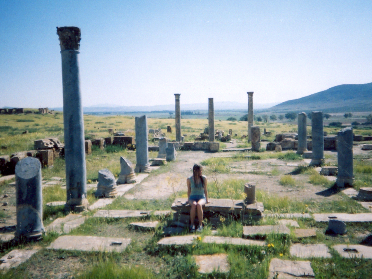
Here, a combination of perspective, framing and silhouetted lighting add to the serene view of a female walking silently through a historical setting.

Perspective, framing and monotone gives this shot a documentary style shot capturing the intrigue of this alley in the back streets of a Tunisian market.

Framing and reflection combine here to provide this semi-abstract view of a female looking into a mirror while framed by her own legs.