Oi! Keep The Noise Down – getting the visual mix right
February 25, 2020
Basically, there are three things to consider when composing a shot. The subject, the context and noise.
01 The subject
The person, object or view that you are attempting to capture.
02 The context
Anything else around the subject that is relevant to it and enhances the message of the picture.
03 Noise
Anything around the subject that is irrelevant.
The idea of good composition is to capture the subject in enough context to produce a powerful image with as little noise in the shot as possible.

We will start with a very obvious example. This image might work as an example of tourist overcrowding at Pompeii, but it is far too cluttered to have much visual impact. The interesting features, such as the stepping stones to help ancient citizens cross sewage flooded streets, are lost amongst the masses of visitors.

Sometimes, the only solution to a crowded shot is to move and find a similar location nearby minus the invasion of other people.
You can always return and recheck the first location later.
But there are other types of noise that can be far less obvious. Pinpointing these can be tricky, but finding them and removing them from your shot will lift your images to the next level.
Here, we’ve lost the crowds and have even gained the added bonus of the Vesuvius looming in the background. However, that wall on the far left is so large imposing (and without any additional interesting features to add) that it overwhelms the scene.

Changing to a portrait view here crops the wall out of the scene. This enables the perspective of the street to become visually stronger and draws our attention more to the distant volcano.
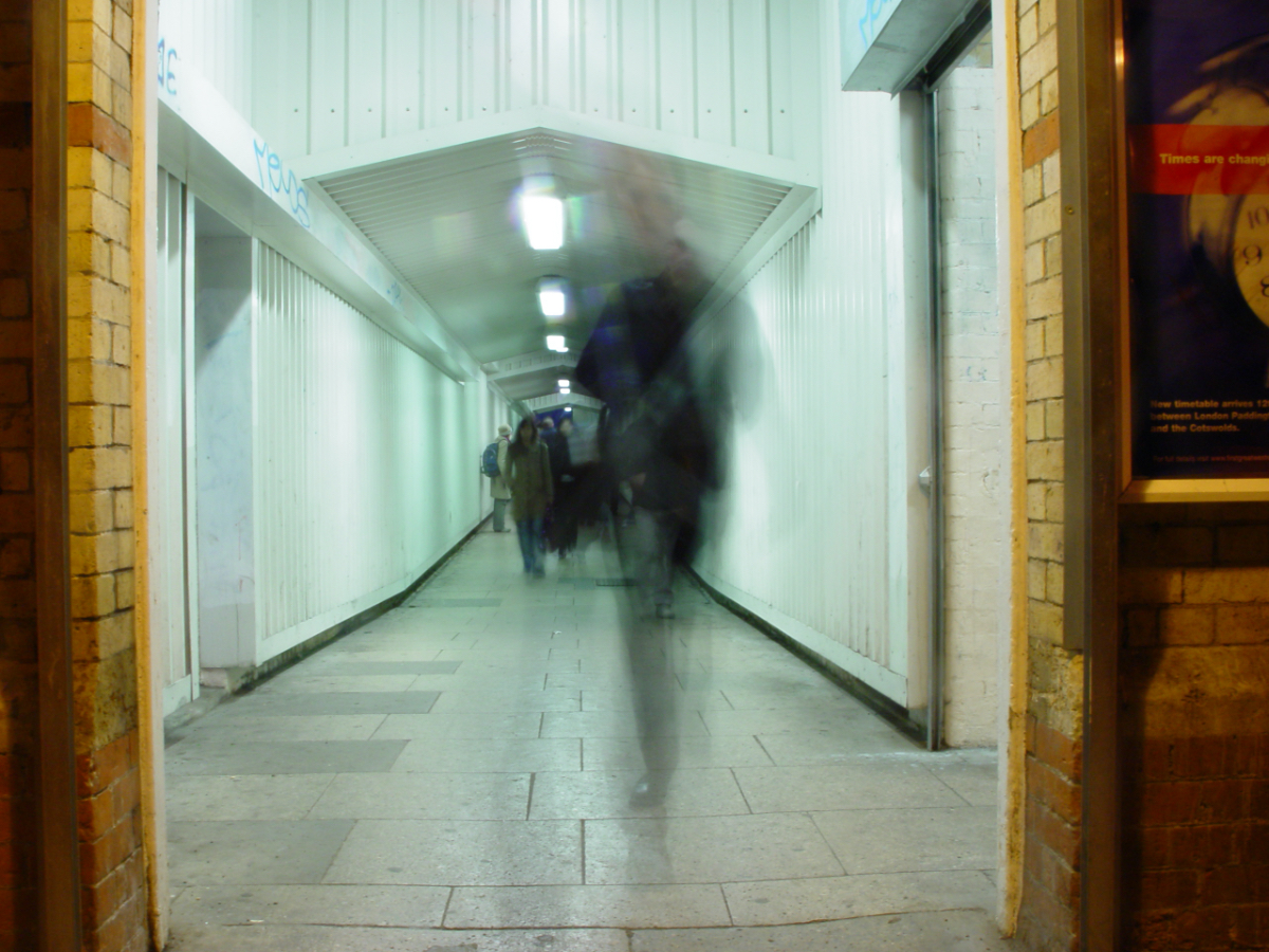
The partial glimpse of poster on the right hand wall draws our attention away from the blurred crowd of commuters surging through the station tunnel. Its stark clarity is too strong against the whispy ethereal figures that we are supposed to be focusing on.

A tighter crop removes the distracting poster, but a slither of wall has been left to frame the image.

The steps here eat up a large chunk of the lower portion of this image and also physically remove us from the subject.

Cropping out the step and going for a landscape format places us right into the scene with the subject and opens up the looming forest to feel larger and more foreboding.

A street light and light-coloured conservatory roof in the lower right hand portion of this image distracts away from the light and dark duality between the sunset and the tree silhouette.

These other lights could be air-brushed out, but cropping out the distracting elements gives a much more abstract scene where the tree resembles ink spilling up from the dark ground below.

The doorframe and handle distract here.

In this case, some simple airbrushing fixes the background and gives a much cleaner image.

This was part of a series exploring different viewpoints. Here, I was looking to capture a scene as if viewed from within a bulb socket in the ceiling.
One issue here is the door hinge in the background is a distraction.
Also, though not strictly noise, the bulb is a slightly the wrong angle and makes for a weaker shot.

Altering the angle has removed the hinge, but that curtain edge is now fighting for our attention.

Moving in much closer, the background noise has been eliminated, but the bulb is obscuring too much of the female and so we’ve lost a bit too much context along with the noise.

The final shot. The blurred curtains have no stark edges to fight for our attention, but the subtle verticals all lead our eyes in towards the plug like flower petals.

In very minimal images, it can be tricky to define what is subject, context and noise. There’s nothing wrong with this shot, but due to the distance, the birds are a little small. The light is as much the subject as the birds.
Also, the fact that there are 3 birds means they are just a group of birds. We don’t examine their relationship and interaction too much. At a push, has the left hand bird been shunned by the other 2?

Look what happens when we change the crop. By removing some of the light, we’ve diminished its significance. Also, by focusing in on just 2 birds, we’re being made to think about this specific interaction.
This is also about picking the right moment. The left hand, previously-shunned, bird has now turned to face the other.

By zooming right in, the light is now no longer a light. It is simply a perch. At this close, we can clearly see the faces of the birds and so their interaction becomes much easier to which to apply an imagined narrative.

This image, based on the story of ‘The Princess and the Pea’, has some very subtle noise within it.
Firstly, there are some crumbs fallen onto the ‘ER’ area of ‘DINNER’ that would be best removed.
Secondly, the text around the plate is a little problematic. It says ‘LUNCH DINNER SUPPER’ but NCH is a well known acronym for National Children’s Home. Also, the lone ‘S’ over the back isn’t immediately clear leaving the text ambiguous and distracting.

Crumbs swept away.
By rotating the plate, we’ve reintroduced part of the ‘U’ from lunch and got rid of that lone ‘S’ leaving the subject of the shot with more prominence.

The horizontal branch at the top looks too much like a height measuring bar. But don’t go chopping off branches! Change the tree or change the angle.

Sometimes on a shoot, you can bring along your own noise. This is a much stronger angle, but we’ve accidentally brought a shoe into the scene at bottom left.

No weird branches, no shoes. Just a great shot of a beautiful subject. Also notice that the colour scheme of the clothing and hair complements the natural palette of the context. A vibrant red top here would have been a wrong choice.